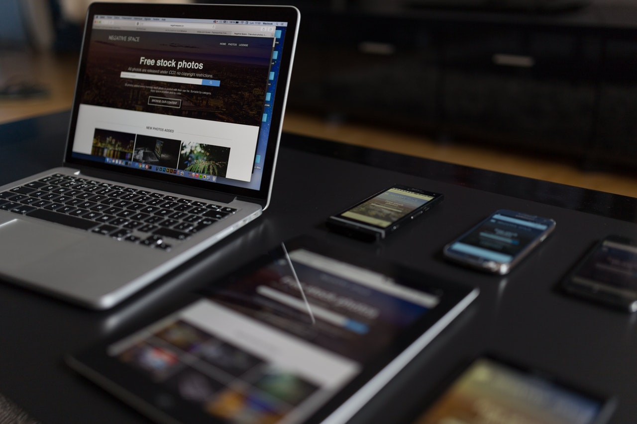
With Samsung’s recent teaser of their foldable smartphone, many more companies will jump on the bandwagon to bring out their own foldable smartphones. There is already one in production that isn’t a Samsung called the Royole FlexPai. If foldable smartphones catch on and become mainstream, what does this mean for web and app development?

Responsiveness
Normally, a website only needs to respond to one device width: mobile, tablet or desktop. With a phone that can turn into a tablet, having a responsive website brings on a whole new meaning. Currently, there are media queries and other tools that allow developers to create breakpoints in code to signify how to show a website. Usually those are mobile, tablet and desktop. With a phone that has a screen that either folds onto itself or folds around the back, it brings about some interesting questions. Where will my page-breaks be? How many different screen sizes are going to be available? Are there multiple screens or one big one?

Website/Page Speed
Your website should already be fast. Users don’t want to stay on a website that takes forever to load. Usually, people will wait around for about 5 seconds before deciding that your page isn’t worth it. Speaking from experience, this is the same for when you turn your phone to see a site in landscape mode. If it takes too long to load the page after turning the phone, it’s not worth it to stick around!
With a phone that becomes a tablet that becomes a phone, your website will need to be lightning fast. This is not only speed for how fast it loads but also how fast it can change from phone to tablet and back. Granted, some of the speed depends on the browser they are using, the operating system of the folding phone, how much RAM, etc. But you can make it much easier and much more enjoyable for everyone who visits your site if you keep these things in mind when creating the website.

User Experience
The User Experience is something that every website owner should think about when the website is being created. This is sometimes called UX or UI Design. For more information on UX/UI and other things that web developers need to think about, check out this other article on What Web Developers Do. The way that the user interacts with your website is already something very important for ‘normal’ interactions. A phone that can become a tablet may have completely different interactions than a phone or a tablet. Most likely, folding smartphones will have very similar interactions to tablets and smartphones. It’s the developer’s job to think about this and how visitors will react to the website.
The foldable smartphone is a whole new beast for web and app developers to conquer. The savvy website builder will start to think about what it will mean for the future of web and mobile apps. For specs and more info on Samsung’s foldable smartphone, the Verge has a great article with tons of details about the new phone.
So now you know all about folding smartphones. Now what? Visit our Facebook Page or explore this site for info on how to get started in web development. There are so many resources out there to help you on your journey. Discover the astonishing things you can do with the web!


Leave a Reply